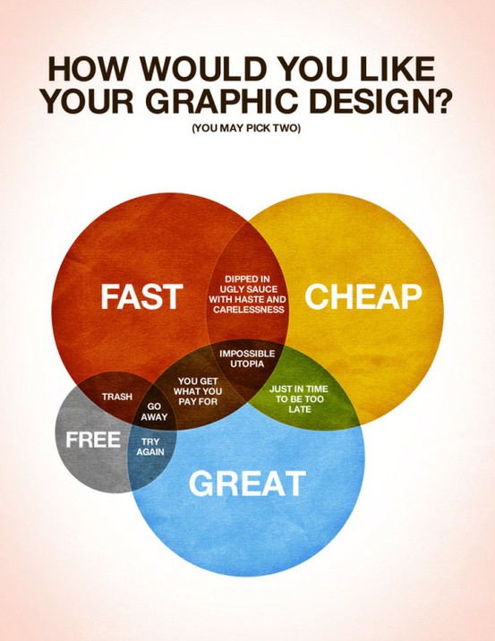
How Would You Like Your Graphic Design?
Posted in Design, Graphic, Infographics by Design RobotI spotted this
brilliantly witty poster the other day. Created by Colin Harman, I think it’s a great use of the old Venn Diagram, and a lovely quip on Graphic Designer / Client expectations.
Here’s what Colin has to say about it…
There are times when things just need to be explained using a spectacular Venn diagram. I made this last night whilst sitting on a screened in porch by an outdoor fireplace when it was late. Design is a funny thing, not as funny as a Kangaroo jumping on a trampoline, but let’s be honest what is as funny as that? I’ll give you a little hint: nothing.
Anyways, I love design, but it has it’s limitations in the creation process. Hopefully this helps you understand what those are and help you choose how you would like your design work in the future.
Due to demand, Mr Harman has now created some inkjet prints for sale here. Personally, I’d have gone all out and created a 5 colour screen print… but who am I to judge 
Facebook Comments:


